Build a Flower Palette That Holds Together
A garden border can contain dozens of beautiful flowers and still feel unsettled. The trouble often begins at the nursery, where each plant earns its place through an irresistible bloom rather than a relationship with its neighbors. Annuals give you a chance to solve that problem in a single growing season: choose a few colors, repeat them with intention, and let differences in flower shape supply the movement. A coral zinnia beside violet salvia creates a different experience from the same zinnia beside yellow marigolds, even though neither pairing requires complicated design knowledge. The strongest combination also shares sunlight, moisture, and space requirements, so its colors remain balanced after the plants leave their small nursery pots. Whether you are filling a long border, refreshing a front entrance, or planting a few summer containers, begin with the scene you want to see from your usual viewpoint. Then use color, foliage, and proportion to make the individual flowers belong to that scene.
A: Yes, several colors can work when one leads and repeated accents connect the rest of the bed.
A: White flowers, cool hues, and contrasting foliage may stand out; compare actual plants beside your brick wall.
A: They can, provided their proportions, mature sizes, and growing requirements suit the same planting space.
A: Broader groups of pale flowers against darker foliage make pastel colors easier to see from the street.
A: No, green foliage or a quieter flower shade can separate strong accents without including white blooms.
A: No, repeat a connecting color while choosing flowers that suit each container's particular exposure and space.
A: Yes, compatible ornamental foliage can carry the scheme while flowers pause or change through summer.
A: The accent may be between flower flushes or hidden by neighboring growth; inspect its buds and visibility.
A: Lighting, flower age, and growing conditions can change its appearance, so allow some natural variation outdoors.
A: Record cultivar names, photographs, mature proportions, and summer flowering performance, along with one useful adjustment.
Choose the Mood Before Choosing the Plants
Start by deciding whether the planting should feel quiet, playful, warm, or dramatic. A border dominated by pale pink, lavender, and white tends to read differently from a bed of orange, scarlet, and golden yellow, especially at a distance. Neither is inherently better, and the surrounding landscape can change the result. Dark evergreens make light flowers conspicuous, while a bright stucco wall may overwhelm a collection of delicate pastel blooms. Stand where you will actually enjoy the planting and look at the background before collecting flowers that seem attractive in isolation.
Give one color a leading role rather than assigning every hue equal space. You might build most of a sunny bed around violet flowers, add smaller groups of coral, and allow green foliage to occupy the gaps. The dominant color provides continuity, and the accent introduces a place for the eye to pause. Exact percentages are unnecessary because flower size, bloom density, and foliage all affect visual weight. A few large orange zinnia heads can command more attention than a much larger patch of small lavender blossoms, so adjust the balance by looking at the whole composition.
Use Neighboring Colors for an Easy, Connected Look
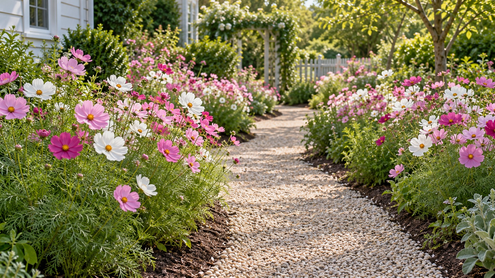
Colors that sit near one another on a color wheel usually combine without a sharp visual break. Pink, rose, and violet offer one familiar approach; yellow, orange, and red offer another. These groupings are useful when you want abundance without a scattered appearance, because several kinds of flowers can share a recognizable color family. Choose variations in lightness as well as hue. Pale pink verbena, deeper rose petunias, and plum-toned foliage can give a planting depth even when the overall palette remains restrained.
A neighboring-color scheme still needs contrast somewhere. If every flower has the same medium tone and rounded shape, the planting can merge into a single indistinct mass. Mix a broad bloom with a vertical flower spike, or place fine-textured foliage near a larger leaf. A pale flower can create a highlight among deeper colors without introducing an entirely new hue. These differences help individual plants remain visible while preserving the connection that makes the palette comfortable to look at over a long season.
Treat catalog photographs as an introduction rather than a precise color reference. Screen settings, lighting, and plant age can make a named shade look different from the flower that arrives in your garden. When possible, place actual nursery plants beside one another outdoors before buying a large quantity. Turn a pot so you can see its foliage as well as its blossoms. If a combination looks good only when you hide one plant's leaves, it may be difficult to maintain once the plants grow together.
Make Complementary Colors Work Without Overloading the Bed
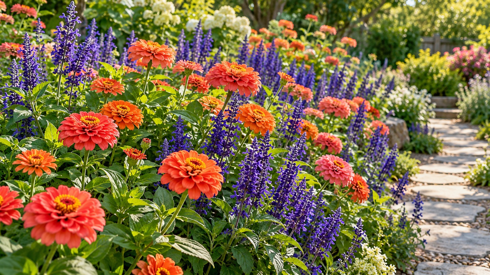
Opposing colors such as violet and yellow or blue and orange can give annual plantings a lively focal point. The effect is strongest when the colors appear near each other, but a whole bed filled equally with both can feel visually busy. Use one hue broadly and the other in smaller repeated accents, then include foliage or a softer flower color between the most intense groups. Blue annual salvia with orange zinnias is one sunny example when the selected cultivars have compatible sizes. In a smaller space, a violet petunia paired with a modest cluster of yellow flowers may provide all the contrast you need. Step back after arranging the pots: the question is whether you can follow the planting comfortably, rather than whether each individual pairing is exciting.
Let Foliage Carry Part of the Color Scheme
Leaves form the background of an annual planting for far more hours than any single flower remains open. Green is therefore part of the palette, and its variations deserve attention. Broad dark leaves can steady a collection of bright blossoms, while fine light-green foliage gives a softer appearance. Burgundy coleus or alternanthera can connect pink and red flowers without needing a matching bloom. Silver-leaved plants can lighten a design, although their preferred moisture and exposure must fit the other plants rather than simply their color.
Coleus is especially useful for experiments because its leaves may combine lime, burgundy, cream, and pink within one plant. Select the cultivar first and draw one or two flower colors from the leaf pattern. That creates a visible reason for the combination, even when the flowers are quite different in shape. Check the cultivar's light guidance carefully: some coleus tolerate substantial sun, while others perform better with protection from harsh exposure. A foliage anchor that scorches or stretches cannot provide the steady visual structure you expected.
Avoid filling every open space with another accent leaf. Strongly variegated foliage already contains several competing edges and colors, so it often benefits from simpler neighbors. A plain green plant may do more for a complicated composition than another showy purchase. Evaluate the bed between bloom flushes as well as at its peak. If the leaf textures, heights, and color relationships remain attractive when several flowers are resting, the planting has a foundation that should make routine maintenance easier.
Match the Palette to Light, Distance, and Surroundings
Color changes with the conditions in which you see it. Pale flowers can be conspicuous in evening light, while saturated warm colors often remain recognizable across a sunny lawn. A bed beside a sitting area allows you to appreciate subtle differences between lavender and mauve; a planting viewed mostly from the street needs larger, clearer groups. Think about the hour when you are usually outside. Morning shade, harsh afternoon sun, and dusk each change how the same flowers stand out against their surroundings.
The house, paving, fences, and garden furniture also contribute color. Against red brick, orange flowers may blend into the background unless leaves or lighter blooms create separation. Near a cool gray wall, coral or yellow can become a distinct accent. You do not need to match the building, but you should know whether the relationship feels deliberate. Take an ordinary photograph from your main viewpoint and review the image at a small size. Large color masses become more obvious, and minor flower details stop distracting you from the design.
Check Growing Compatibility Before Committing to a Pairing
A visually promising pair can fail when one plant wants consistently moist soil and the other needs a much drier root zone. Start with the actual sunlight and drainage in the bed, then choose annuals that suit those conditions before refining the palette. Many zinnias and annual salvias work in sunny situations, while shade-oriented combinations might use suitable begonias, impatiens, or coleus cultivars. Even within these groups, disease resistance, heat response, and mature dimensions vary. Read the cultivar information rather than relying on a broad common name, and avoid squeezing plants together to imitate the fullness of a finished photograph. A combination deserves its space only when its members can grow well under the care you can realistically provide.
Repeat Colors While Varying Flower Shapes
Repetition connects separate parts of a garden. Carrying the same coral flower into three places along a border can make the eye move through the scene, whereas a single coral plant may look like an accidental addition. The repeated plants need not form identical circles or follow rigid spacing. Their purpose is to create recognizable echoes. Choose groups large enough to remain visible after neighboring plants expand, and consider how the view changes when you walk around the bed rather than standing in one fixed spot.
Within those repeated colors, use shape to prevent monotony. Rounded zinnia flowers, slender salvia spikes, and airy cosmos create different outlines and levels of openness. Match their mature scale so the tallest plant contributes height without hiding the rest. Compact cultivars can be valuable near a path or in a small bed where tall varieties would overwhelm the composition. A single flower form may be enough for a narrow edging, but a broader planting usually benefits from a few contrasting silhouettes that remain visible above the foliage.
Build a Small Trial Before Planting the Whole Border
Arrange the plants while they are still in their pots and leave room for their eventual width. Look at the group from the house, the path, and the place where you sit. A design that reads clearly from above can feel quite different at eye level, where leaves and stems overlap. If you are uncertain, plant one modest section first rather than filling the entire bed immediately. Annuals allow a quick experiment, but you still save money and work by discovering a weak combination before repeating it everywhere.
Keep the trial limited enough that you can understand what changed. If you replace the color scheme, the plant sizes, and the layout all at once, it becomes difficult to learn which decision improved the result. Photograph the bed after establishment and again when the plants are flowering strongly. Notice which hue spreads, which one disappears, and whether any plant has taken more room than expected. These observations are more useful for next year's purchase than a general memory that the garden was either pretty or disappointing.
Containers can provide a separate trial, but they introduce their own conditions. Potting mix dries differently from garden soil, roots share a limited volume, and a crowded display may require frequent watering. A pairing that performs well in a large pot will not necessarily behave identically in the ground. Use the container to test the visual relationship, then check the growth requirements again before expanding the idea into a border. The experiment should clarify your choices rather than create an expectation that every planting situation will produce the same result.
Keep the Balance as the Season Moves On
Annual color combinations change because plants grow at different rates and flower in different rhythms. A compact spring purchase may become the largest visual mass by midsummer, while another plant pauses in extreme heat. Remove spent blooms where that helps the species, address moisture problems early, and trim only when the plant tolerates the treatment. If one color temporarily disappears, resist immediately adding a new unrelated flower. The original plant may recover, and a short pause can be less disruptive than a permanent extra accent.
At the end of the season, record the relationships that worked: the dominant color, the most useful accent, the foliage that linked them, and the cultivars that stayed in proportion. Make the next year's changes specific, such as using fewer yellow flowers or choosing a shorter salvia, instead of starting from an entirely new collection. A successful palette grows from attention to the garden you actually have. With compatible plants, clear repetition, and enough variation in shape and tone, annuals can provide a vivid display that feels connected from its first flowers to its final weeks.
Plan the Planting and Its Supplies Together
Once you have chosen a color relationship, select tools and containers that help you maintain the plants’ growing conditions. Explore Garden Product Reviews for practical equipment choices, and consult Illinois Extension’s annual flower guidance when checking plant habits.